Painting a Novel

There is a lot of advice out there geared toward writers, but I find it more helpful to think of the process the way a Renaissance painter might approach a new painting.

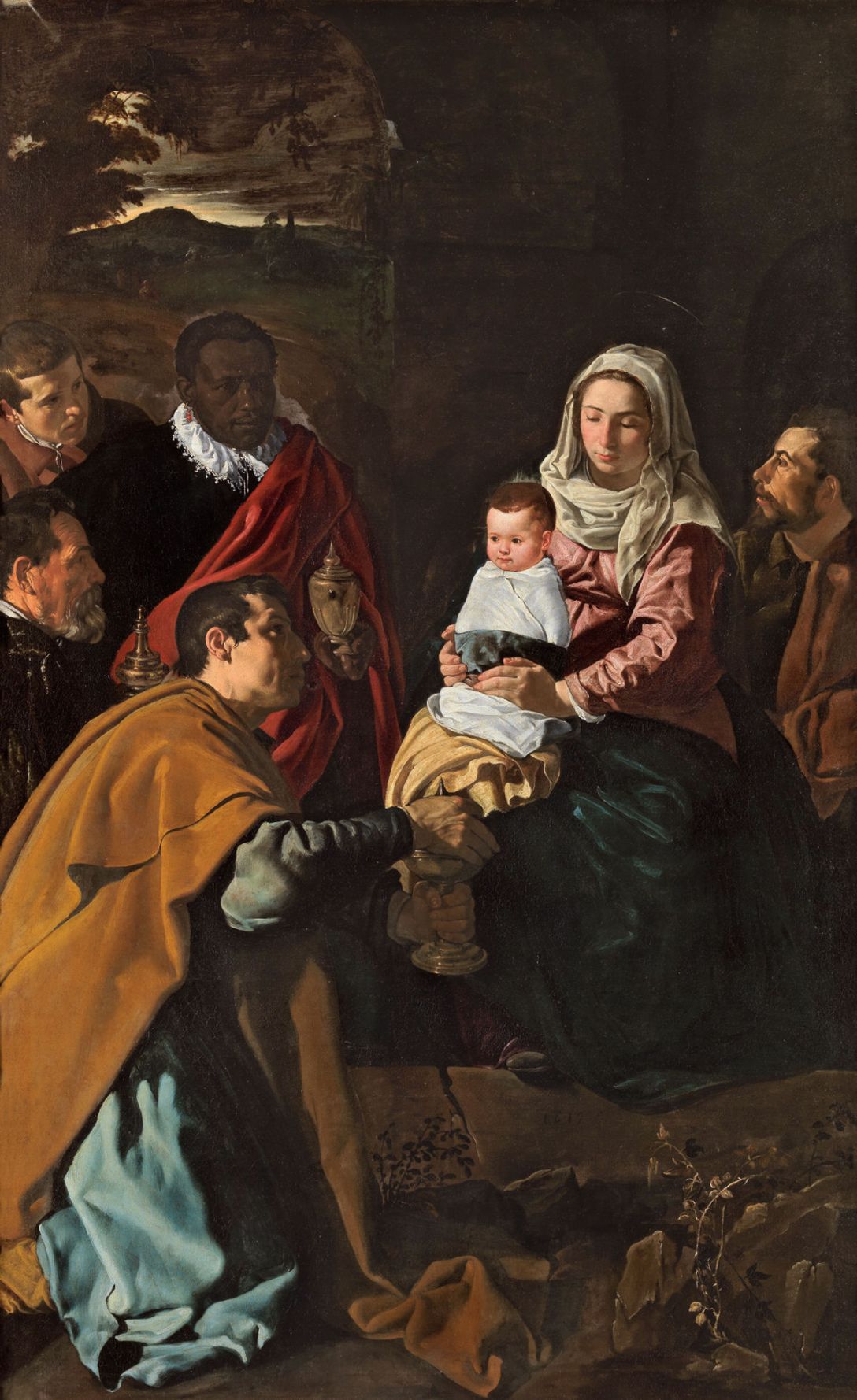
First, a theme, the more specific the better. “Motherly love” is nice but vague. “The wistful feelings of a mother gazing at her child knowing that child will grow beyond her reach and will suffer in ways she cannot prevent” is more specific and, by the narrowness of its scope, makes it easier for us and our audience to gauge our success. Limitations are freeing; by defining a narrow scope of theme, we automatically rule out a vast amount of material that doesn’t belong in our composition, and now we can focus on the few things that really matter. In this case, the expression on the mother’s face, the tilt of her head, the set of her mouth, and especially her eyes.

Continue reading “Painting a Novel”
The Dragon of Iletupa

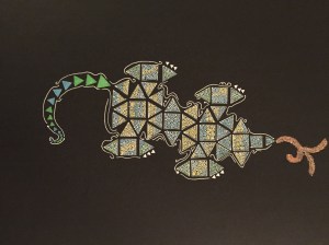
Is it wrong to start designing the cover art before you write the book? I hope not. These are pen-and-ink studies for the cover art of The Dragon of Iletupa, the next novel I’m working on. The first one began as studies of dragon scales and then turned into an odd little street scene with characters taking their colorful balloons for a walk. This in turn inspired a limerick entitled ‘The Droll Encounter.’

The other two managed to come out looking like dragons. Progress!

While taking his balloons for a stroll / Professor Lanyard encountered a troll / A White-Crested Rail and a belligerent snail / Under circumstances unusually droll.
cover art study 2
cover art study 3

Color by Number #3: Wizard

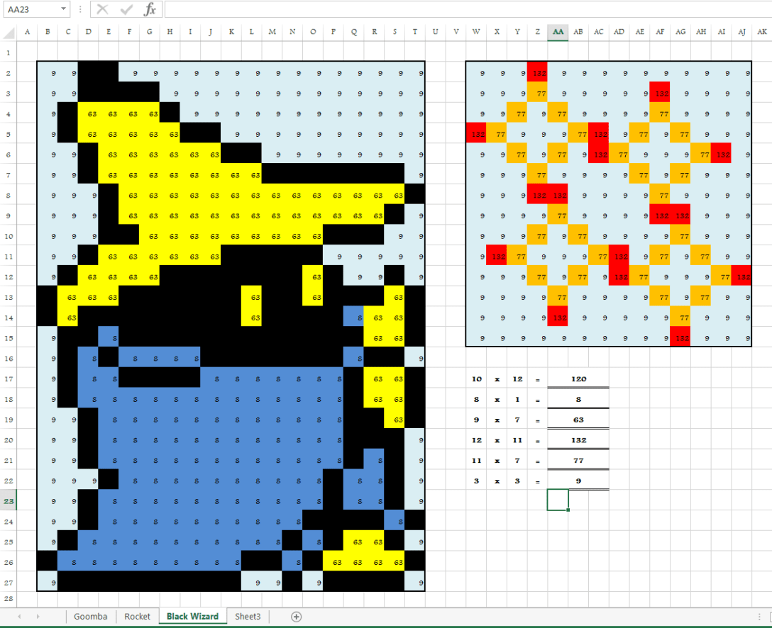
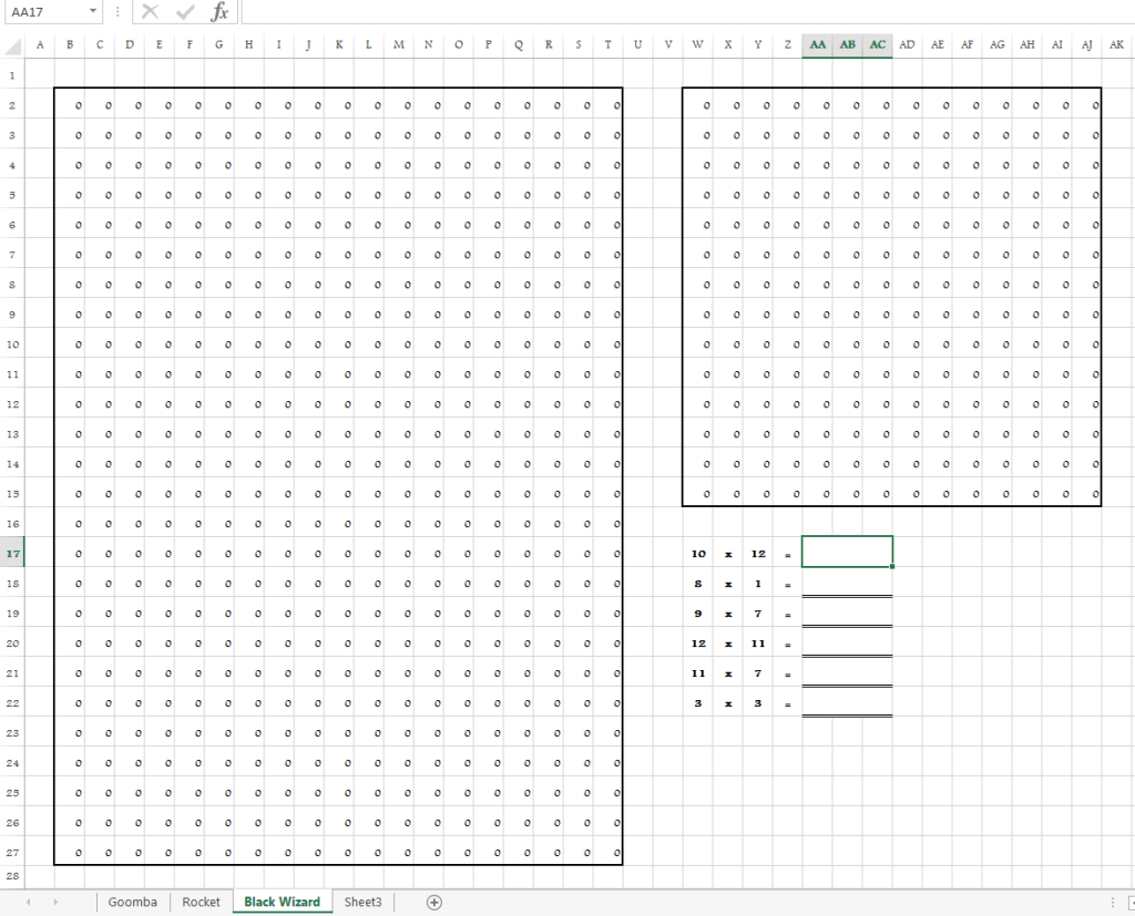
This is the latest in my series of Excel color-by-number worksheets. This one is aimed at introducing students to some of the ‘magical’ properties of multiplication. Multiplication by 1, 10, 11, 9, and squares are all touched on here. For those who aren’t rabid fans of 80’s Nintendo video games, the character is the Black Mage from the game Final Fantasy, unleashing a QUAKE spell.

Because math is earth-shaking.

My next challenge is to figure out how to let the player choose which spell the Black Mage casts. I sense some heavy IF/THEN in my future . . .

Color by Number #1: Goomba

This is the first in a series of color by number games I’m designing in Microsoft Excel. The worksheet uses conditional formatting to change the fill color of specific cells based on their contents. Then I add a simple formula (=[cell number]) to link the indicated cell to the place where the user types in the answer to the addition question. If they get the answer right, the cells change color, gradually making a picture.

This one is super simple, just four addition questions that yield the image of a Goomba from Super Mario Brothers ™.

Any kind of pixel art is easy to do; you just have to count how many pixels high and wide the image is so you know how many cells in the worksheet you need. Then resize the cells so they are square and go crazy with the conditional formatting. It’s a good idea to go into File — Options — Formulas — Error Checking Rules and uncheck “Formulas inconsistent with other formulas in the region”, otherwise you’ll get unsightly little green triangles in the corners of the cells in your image.

A Model of Human Psychology

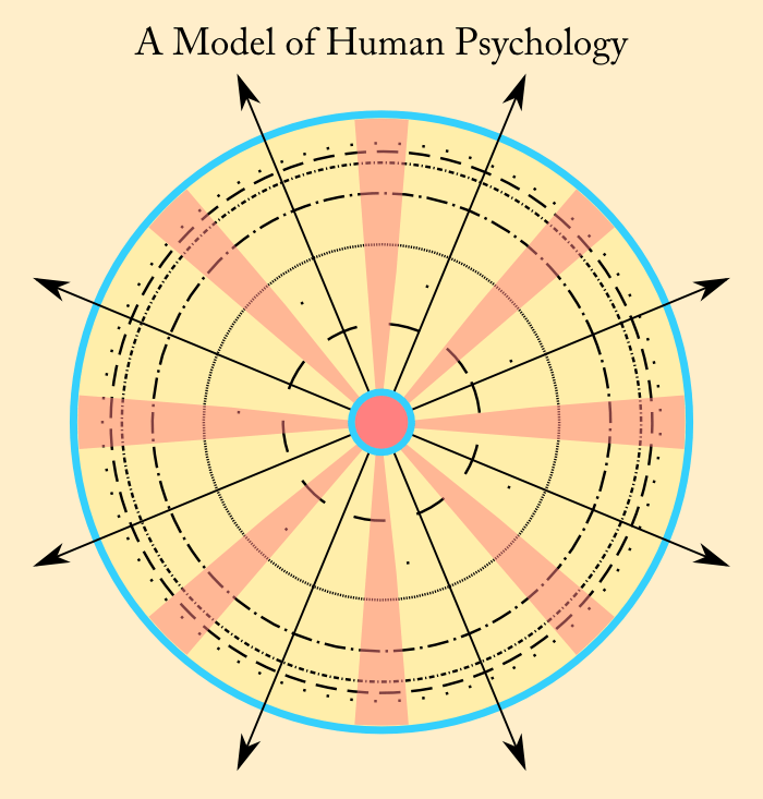
This came to me in a dream one night. The concept is difficult to convey with 2D graphics; a 3D animation might be more suitable. The upshot is that the outward manifestations of personality are the result of the dialectic between the base desires (common to all humans) and the psychological filters accumulated through life experience (unique to each individual).

Any suggestions for changes to the model, or ideas for how to make it visually more effective?


Logo Design

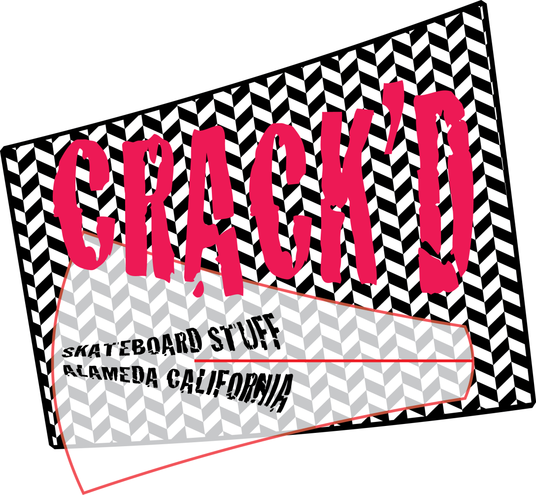
The first five logos in the gallery below are the result of a project I did a few years ago to teach myself Adobe Illustrator. I chose a typeface with an evocative name (Algerian, Crack’d, Chalkduster, Caduceus, Eccentric – you can tell I didn’t get far in the alphabet) and designed a logo inspired by and utilizing the typeface.

The sixth logo, Petal + Stump, was an prototype I developed for a garden blog a friend was contemplating doing. After downloading numerous free fonts from the internet to play with and working for about two or three hours tweaking the design, I discovered that garden writer Valerie Easton had already published a book called Petal & Twig. So much for that idea. But the experience was worthwhile. The typefaces in Petal + Stump are PetalGlyph by Stephen Knousse and JF Wildwood by Jester Font Studio. I did Petal + Stump in Inkscape.

Continue reading “Logo Design”

Board Game Spinner

I designed this after I first had the idea for a Perilous Jack board game. I’m still debating whether to use it with The Curse of Numerian Nine, but I’m not convinced it works with that game. We’ll see how Numerian Nine evolves.

I did this in Inkscape, with a little bit of touch-up and prep work in MS Paint. The typeface is Hobo. The sprites are all ripped from Final Fantasy ™ by the good folks at VideoGameSprites.net


The Curse of Numerian Nine

The Curse of Numerian Nine is a fantasy adventure board game I’ve been developing. The game is for two to eight players and it is set in the Kingdom of Numeria, on the world of Malkat. I did the board game map in Campaign Cartographer 3, with symbols borrowed from Dungeon Designer 3 and City Designer 3. I’ll add the finishing touches in Inkscape.

Here’s the premise of the game:

Continue reading “The Curse of Numerian Nine”