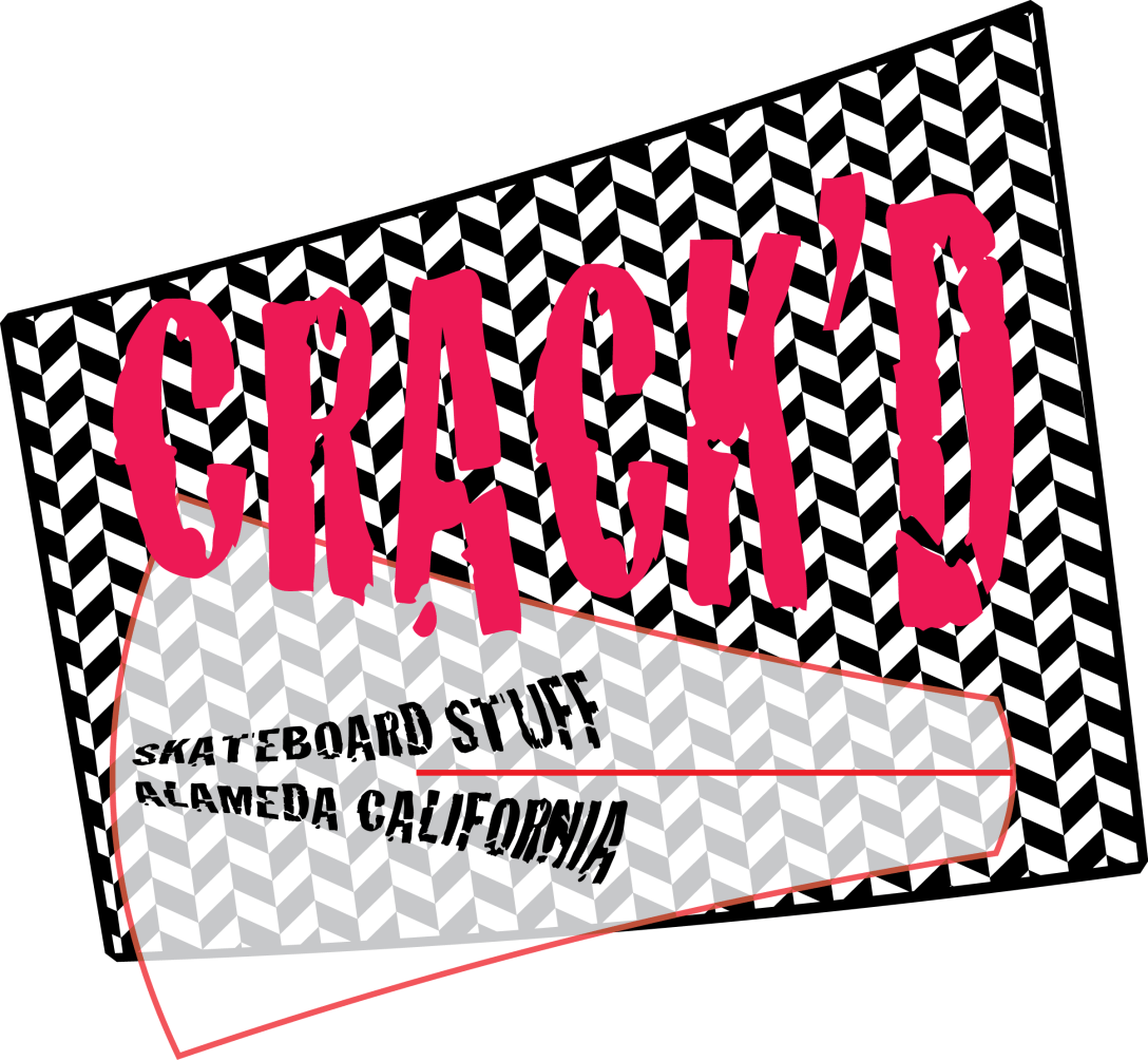
The first five logos in the gallery below are the result of a project I did a few years ago to teach myself Adobe Illustrator. I chose a typeface with an evocative name (Algerian, Crack’d, Chalkduster, Caduceus, Eccentric – you can tell I didn’t get far in the alphabet) and designed a logo inspired by and utilizing the typeface.
The sixth logo, Petal + Stump, was an prototype I developed for a garden blog a friend was contemplating doing. After downloading numerous free fonts from the internet to play with and working for about two or three hours tweaking the design, I discovered that garden writer Valerie Easton had already published a book called Petal & Twig. So much for that idea. But the experience was worthwhile. The typefaces in Petal + Stump are PetalGlyph by Stephen Knousse and JF Wildwood by Jester Font Studio. I did Petal + Stump in Inkscape.
I find that limiting myself artistically, whether it’s setting rules about typefaces, choosing a color palette when painting, or writing haiku, often leads to greater inspiration. What do you think? Do limits set us free? What kind of self-imposed limits do you use in your art?


